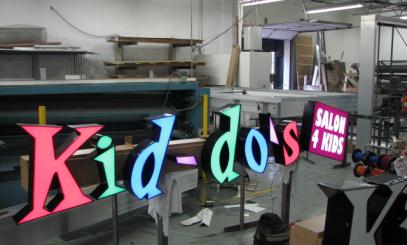
In my experience with creating exterior building signage for designers, contractors and architects…great design always strikes emotion. I like to call it the “sculptural interpretation of graphic art”. We’ve all heard the old saying that goes “you know it when you see it.” With great sign design and fabrication, that old saying goes “you know it when you feel it”!
This article pinpoints the key elements in design that contribute to the visibility of exterior building signage. We illustrate those elements with a number of examples.
Size: Determining the size of your exterior sign depends on the setting. For example,a 10 foot coffee cup may seem to be an exaggerated size for a coffee retailer. However, when the cup is installed on the rooftop of a 3 story building adjacent to a four-lane highway, it is actually the perfect size. That was the case when we built and installed a giant coffee cup on top of Stone Creek Coffee’s new office, training facility and store in downtown Milwaukee.
Angle: Think about every angle of rotation of your new sign. Replay is a sports bar located in a crowded urban setting on a very busy intersection. So we designed, built and installed a vertically oriented illuminated sign for them on the front corner of the building that can be seen from just about any angle by motorists and pedestrians.
Location: Line of sight is a very important consideration in making your sign visible to the biggest number of prospective customers. Heavy car and truck traffic would obscure a standard monument sign. For locations such as this, a pylon sign is appropriate because it is usually the most visible of all the freestanding sign types. We built and installed such a sign for Cambeck Petroleum Corporation’s TA Travel Center near Janesville, WI.
Luminance: Neon is a great technology for luminance and for brand identity. And it looks cool at night! That’s why we build a lot of neon signs for restaurants, especially the ones that thrive on a late-night crowd. Divino’s is a good example of a pizza place that promotes itself as an “open late” kind of place. So neon was the perfect light source for their new exterior building signage.
Contrast: Colors that are too similar are hard to read. It’s why outdoor monument signs like the Gauthier Biomedical sign work so well in drawing attention. We built it so that the white letters on the black background create a dramatic and very noticeable look that catches the eye.
I firmly believe that design goes beyond color, shape and copy. Who knows? In the future, good design may incorporate all of the senses: sight, sound, feel, AND smell. Starbucks has done a great job attracting customers with smell in places like airports and shopping malls. What if signs incorporated aromas?!
It takes design to a whole new level. The more senses you can connect with and/or stimulate, the closer you are to striking emotion.
