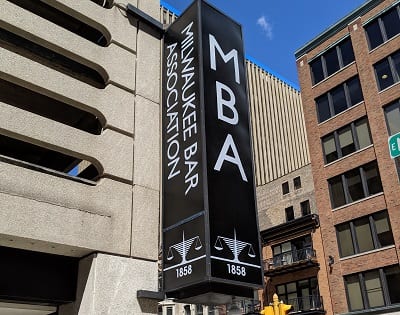
The Milwaukee Bar Association has served Milwaukee’s legal community as well as the public for over 160 years. A recent capital campaign conducted by the association was dedicated to creating an entirely new space for its members at its downtown Milwaukee location. Their goal was to “create a new facility to serve the next generation of legal professionals.”
Sign Effectz, Inc. is delighted to have helped out. We had done work at the association’s previous location. We provided the donor recognition wall there as well as signage removal when they moved. Because of our background, our team of sign designers, fabricators and installers were a good choice for this new project.
In June, 2018, we did our site survey. According to Josh Brown, Sign Effectz Account Manager, “Getting involved before any work on the new space had begun was critical. In fact, the site’s interior was completely stripped bare, just a concrete floor and windows painted pitch black when the association’s director brought me in to share their vision for the new facility. The site was formerly The Grenadier restaurant and lounge.”
We reviewed their interior design concepts, which had evolved through the early stage based on our collaboration with the association. We also carefully reviewed their brand guidelines, which are a very important tool. It provides us with the necessary selections for color scheme, font, etc.

Unique Blade Sign:
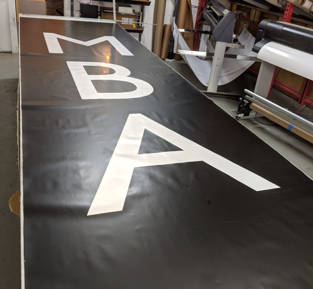
From there, our designer, Adrian Esguerra developed the exterior sign design. Given the association’s corner location in a popular part of downtown, a unique four-sided blade sign was the perfect choice for providing visibility from just about every direction.
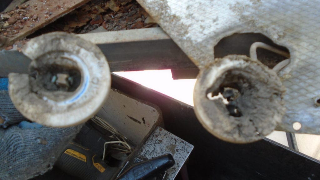
Due to neglect and/or disuse, a good portion of the existing exterior sign frame was corroded and worn out. And there was a number of missing pieces. The electrical hardware was fried and sockets were melted.
Josh underscores the importance of proper sign maintenance at regular intervals would help prevent such conditions. He said, “It was evident that the previous sign had electrical fires. Maybe this was due to lack of maintenance or old technology or maybe even a lack of adherence to code. Regardless, a good maintenance program will keep a sign from falling into disrepair. Signage is such an important contributor to advertising and good visibility. We can’t stress it enough…servicing helps protect the signage investment.”
Coming up with the right panel layout played an important role in getting the blade sign right so we took our time with the client on this part of the project. Here’s how Josh described it, “What’s interesting – you get twice as much square footage as a two-sided blade sign and you get visibility in a 4-way intersection. This is important because the MBA is located on one corner of a well-traveled intersection downtown. It’s essentially 2 two-sided blades signs. For some communities, it’s 4 times the normal square footage of a one-sided blade sign.”
Branded Windows:
One of the primary design challenges was: how do we get rid of the blackened windows and create an environment that would be welcoming and flood the space with natural light? It turns out the solution was good old-fashioned elbow grease! The general contractor’s crew manually removed black paint from 14 very large windows using our recommended approach.
When the windows were completely restored, our guys applied the vinyl logo, using application fluid, a squeegee, and painter’s tape. Frosted vinyl was chosen for the association’s logo to give it a professional etched look at a budget friendly price.
To determine the proper positioning of the association logo on the windows and doors, we calculated average height and placed the logos at eye level. We proportionally increased the logo size from the center point and ensured they weren’t cramming the edges of the doors and windows.
Interior Logo:
The original plan was to use the same frosted vinyl on a big piece of glass to showcase the logo inside the office space. However, as the interior design developed, frost on interior glass can look flat. In order to give it a dimensional feel, we decided to go with clear acrylic with vinyl surface film and cut out letters. Shadows are one of the least expensive, yet effective methods when it comes to creating sign depth. Using ¼” depth clear acrylic with second surface vinyl graphics gives a glass appearance but on a much more economical scale along with a ¼” letter created ½“ of depth.
Donor Recognition Wall:
One of the association’s most important goals was to display the differences between the donors and make the display align aesthetically with the rest of the new interior space. This created the need for a very special donor recognition wall, which recognizes the various levels of donations that were made to the capital campaign.